Right off the bat: this is my band. Now that i made this shameless plug we can talk about how the concept of this song evolved into the artwork and social media posts. Awake the Secrets is a Mathcore-influeced Deathcore band and Unreality is a single recorded by Exiled Media between 2020 and 2021. This songs theme is a very dark and emotional view on our purpose in life, death and the struggles we live every day until the day we inevitably die. Dark stuff. Here’s the lyrics, just to know in which context we are:
Falling asleep on the stale petrichor of the humid dawn
Just my unhearable insecurity
Ineffable homesickness of a place i never lived
Memories of a life i never livedI don’t want to fall asleep again
My dreams become daymares when i wake upPlease, make them stop
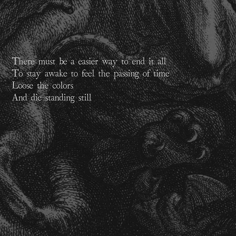
I can’t handle this delusionThere must be a easier way to end it all
To stay awake to feel the passing of time
Loose the colors
And die standing stillStarving for a taste of warmth
Hoping the sun will rise this time
But i already know this won’t happen
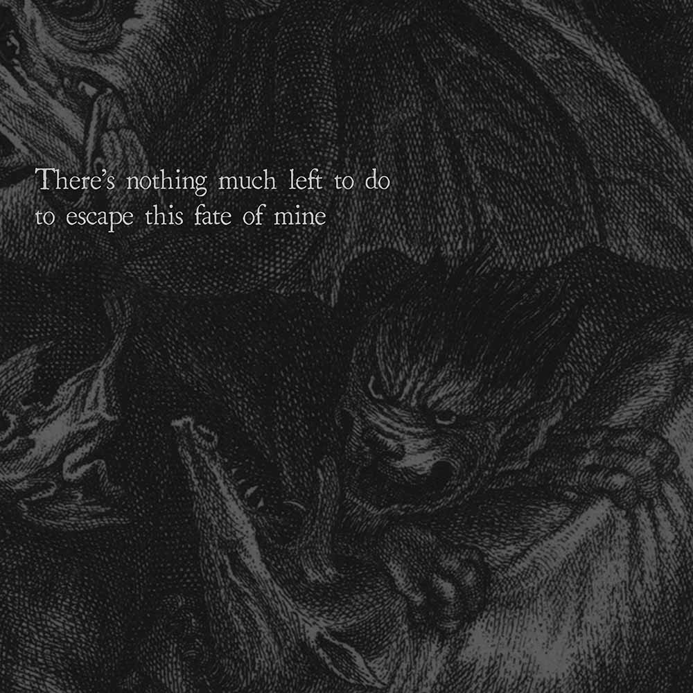
Laying underneath a star-less skyThere’s nothing much left to do
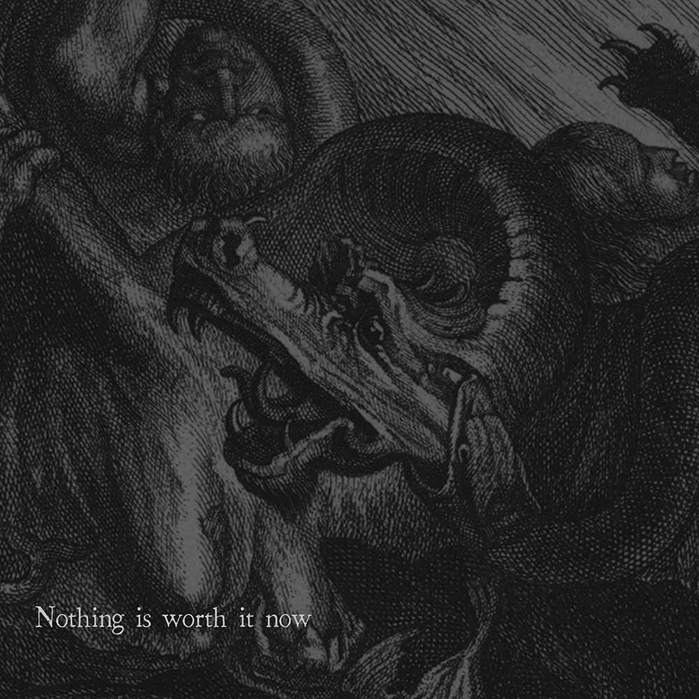
To escape this fate of mineNothing is worth it now
I’ve tried again and again to untie me from this unreality
But the noose is part of my neck nowI can’t go on like this
I’m hitting the ceiling
Again and again
Please let me leave this unreality
With these premises we could go in two different directions: “full emo”, depressive but romantic graphics with toned down colours mixed with chaotic/hardcore elements similar to many Closed Casket type bands or a more obscure, “dusty” and elegant approach, excluding colors and creating a more distinct duality between chaos and sad emotions. We decided that the second direction would fit better the genre and lyrical theme of the song.
So what’s something, or somewhere, chaotic? The answer: Hell. Hell in traditional depictions is the visual definition of chaos, disorder and crude uncontrolled violence. But as said before we wanted something that can also convey sad emotions, other than violent once. So we based this duality on victorian-like engravings and decorations.
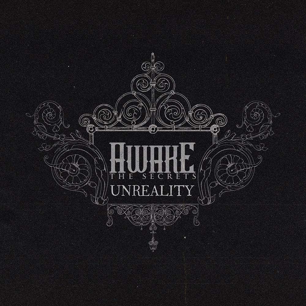
So first of all, before the cover art was in his first steps of creation, the logo and promo material should have being adapted to the path we choose. So a gritty, dusty dark gray background with light gray elements was the obvious choice. No full-black and no full-white elements, just like life nothing is really fully positive or negative.
Color palette: Done. Now we need the artwork.
So Hell, a chaotic yet emotional rapresentation of hell, possibly in an engraving-like style. That seems like a hell of a concept to evolve (pun intended).
Fortunally we found something that really fits all these parameters perfectly and worked on optmizing it to fit even better the theme
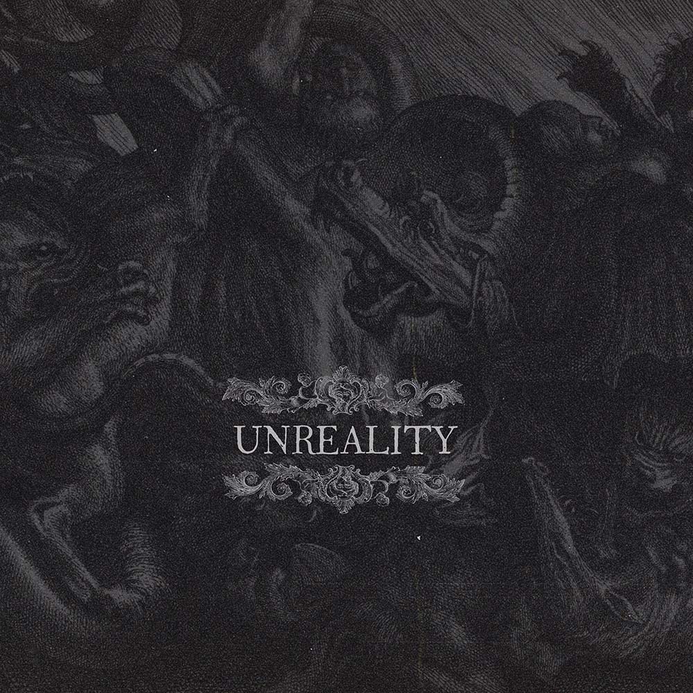
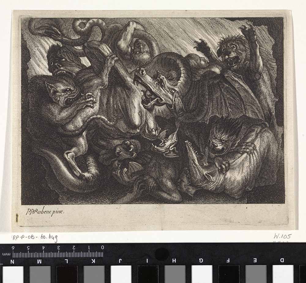
This is “HEL” by Jonas Suyderhoef, an etching and engraving of a Peter Paul Rubens painting.
It features demons and beasts fighting in a confused and violent pile of body parts and menacing demonic faces. “A representation of hell just like the next one” you might say and yeah, you’d probably be right. The sole and single motivation that led us to choose this one is the desperate and scared expression of the central beast/dragon/demon with his eyes about to cry and showing all the discomfort and pain he is feeling in that moment. And that’s so damn perfect for the theme of the song. Just like this beast men are unable to avoid the suffering that bites and tortures them all of their lifes.
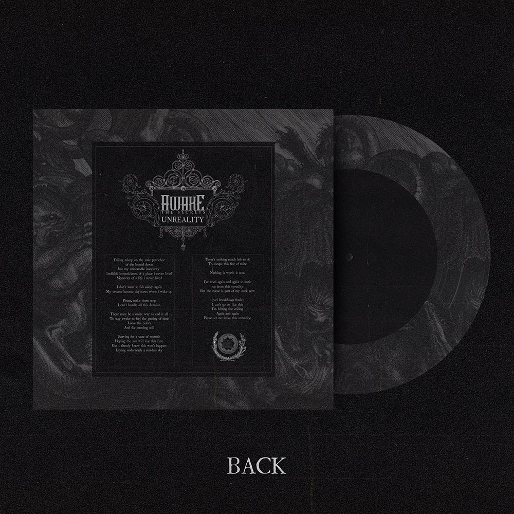
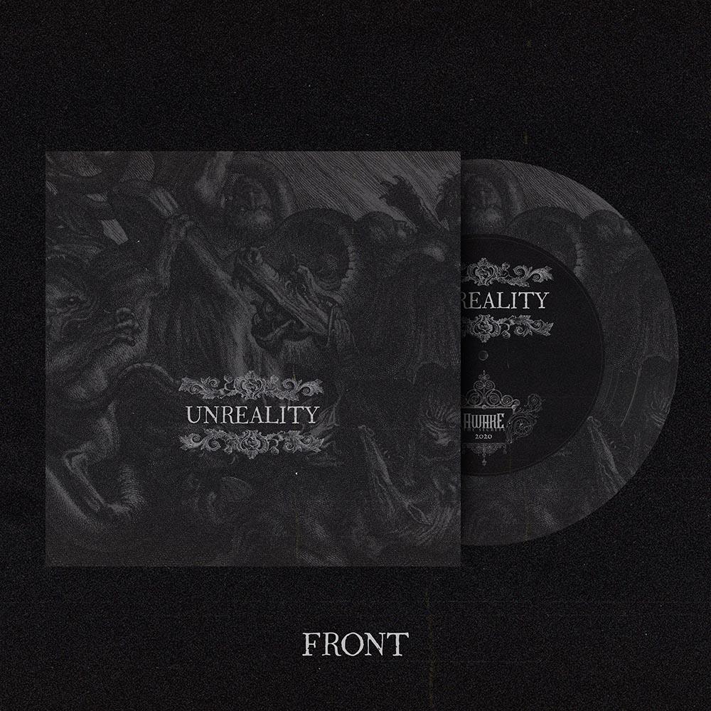
After the righteous fixtures and tweakings to it we came up with the final product you see above. A dark, “foggy”, dusty and elegant snapshot of an hellish situation and setting. Mission accomplished.
The next step is create all the social media posts.
Here some examples you can find on Instagram:
Extras.
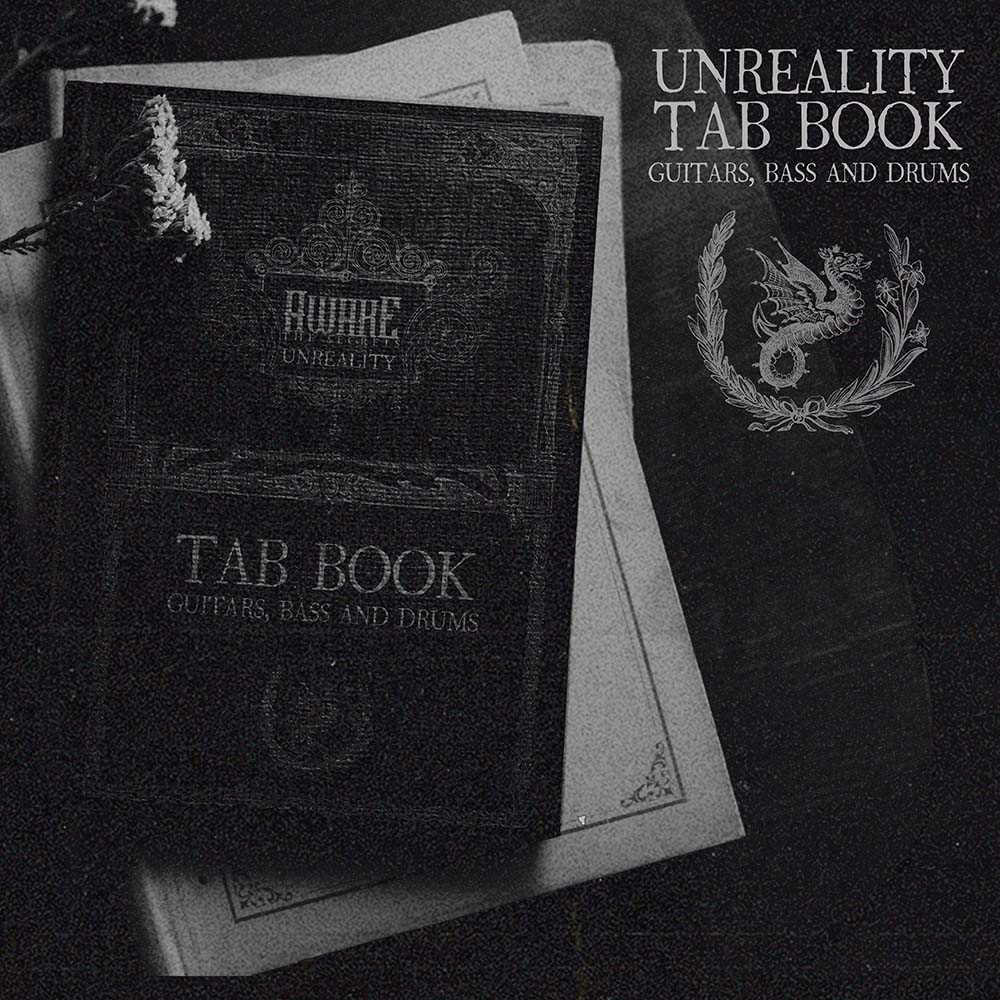
A tab book mockup design and a vinyl record mockup
And now? The video. We wanted to portray the chaos without resolving to any kind of visual SFX or visualizer-like type video and keeping everything DIY.
So we cleaned up our practice space, put on a white blanket as background and one by one recorded multiple performances of us playing the song with prjected images and videos playing on us.
Post production was divided in several steps:
- Selection of the takes of each and every member of the band
- Creation of parallel timelines for each member composed with the best takes of everyone
- Stitching together the performances in a natural flow
- Color grading, blending options of the takes and FX applications
- First rendering and export
- Even more “destructive” FX, addition of disturb and overlays. (This corruption of the video through the application of various layers cemented the chaotic nature of the video)
- Second and final rendering
The final result is a gritty, 4:3 video with a heavy DIY feel that really helps the song though a visual presence to achieve its message.
This is brief and simple breakdown of Unreality’s creative process behind the visual content related to it. Hope you found this interesting because i think that trying to match the song feel with the perfect visual content is the key to have a coherent product and a potential emotional attachment to the piece of art you want to showcase.

